Client:    LH Ventures
Users:   Retail Buyers
My Roles:    UX Research lead
Skills
Generative research: contextual inquiry, card sorting, semi-structured interviews, surveys.
Evaluative research: participatory design, storyboarding, think-alouds, interactive prototyping.
Other skills used: UX/copy writing, print design, wire-framing.
Tools
Google GSuite, Adobe InDesign, Sketch, Principle, InVision, HTML/CSS, Javascript.
The Problem
Retail buyers have to make sense of a ton of information coming at them from their past, present, and future assortments. What are the most desirable features for an enterprise-level order management tool which will have the most significant impact to buyers’ ability to make smarter buys and ultimately increase their productivity?
Our Solution
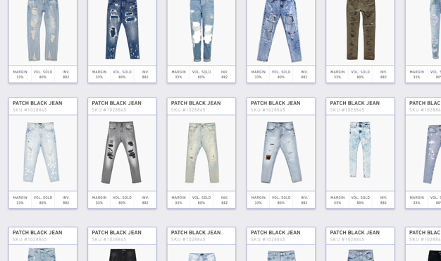
Twenty20 brings the ‘look and feel’ of consumer e-commerce to the enterprise side of the retail industry. By keeping buyers visually connected to their assortments at all stages of the buying timeline, they have the ability to gain insights at a glance that used to be hidden behind rows upon rows of product SKUs in spreadsheet pivot tables. Furthermore, our tool preserves the flexibility to slice and dice the data most important to each buyer in various markets, WITHOUT requiring a custom solution for each retailer.
What information do buyers need at their fingertips in order to be successful?
Research
Interviews
We talked to 30 buyers and their colleagues to learn about their jobs and what they need in order to be successful. Through a combination of contextual inquiries, semi-structured interviews, and open card sorting activities, we became quite familiar with a buyer’s workflow and what information they need in order to be great at their job.
Interpretation & Synthesis
We clustered our notes from each interview into groups on a wall in our office until larger themes started to emerge. When we felt like the notes on the wall represented a comprehensive set of the things discussed in our interviews, we stepped back and created a set of “I need” statements that could be used for the creation of personas.
Journey Mapping
The other artifact to come out of our exhaustive research synthesis is this “Timeline of a Buy” which illustrates the retail buyer’s  process, from pre-purchase to out of stock, and helped us map key decision points to different stages of the buying timeline.
Analogous Domain Exploration
I led a week-long sprint in which we stepped outside the retail industry and into other domains in order to look at the buyer’s activities from new perspectives. In addition to producing unique solution spaces, this helped cement our understanding of a buyer’s main activities.
Research insights
It’s not about giving the buyers the information they need, it’s about helping them make sense of the information they’ve found on their own.
1) People think in narratives, not numbers. 

Great buyers use context to translate product performance data into compelling stories, but they’re doing a lot of extra work to peel the numbers away in order reveal the story.

2) There is more than one opportunity to turn any buy into a good buy.

Great buyers make smart decisions upfront, giving themselves levers to pull as they monitor a product’s performance. Quick and easy communication is key, but the tools don’t often support this.

3) Connecting the Dots.

Great buyers improve their mental model of the mechanics of the market by regularly reflecting on the performance of past purchases, but this is not always easy to do.

We know that great buyers do a lot of extra work in order to make sense of the information they find… so how can we make that easier?
Design Strategy
Design Principles
By translating our research insights into three guiding design principles, we felt confident we could move forward into a solution-oriented mindset:
Make it easy to archive and access past decisions.
Facilitate proactive and reactive actions.
Bring forward the story, not the data.
Storyboard speed dating
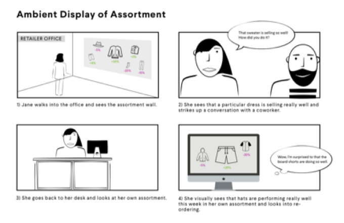
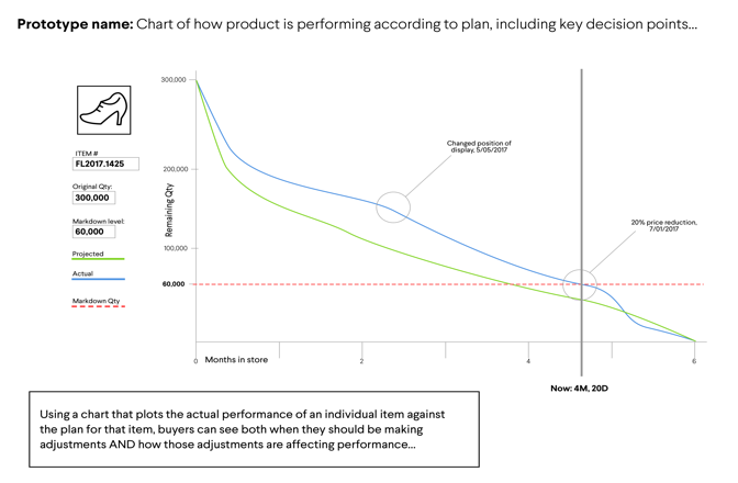
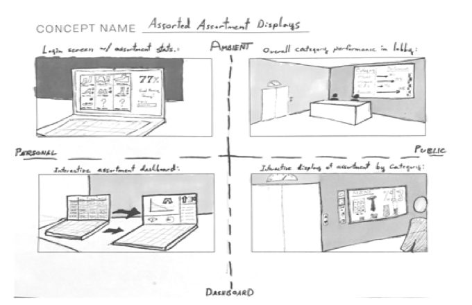
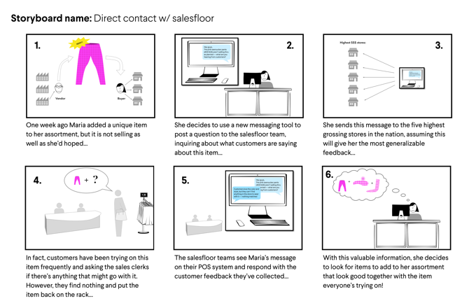
We made dozens of storyboards to explore solution spaces and validate some of our key assumptions about what kinds of tools would help buyers the most. Each one was shown in sequence to participants in our user group (both in-person and over Google Hangouts) and by gauging the response to these various ‘preferred futures’ we were able to focus future sprints on the ideas that got the most enthusiastic responses.
Participatory Design
In order to encourage the receptiveness of our conclusions, we were sure to include our client LH Ventures in or process—the earlier you get the client involved, the more ownership they feel they have over the final product. This 2x2 matrix was an exercise we did with our clients in which our team ranked buyer “need" statements from least to most impactful to success, and then our clients cross-ranked them from easiest to most difficult to implement. This ultimately helped us focus on designing features that most effectively addressed the most urgent needs. 
Remote Collaborative Design
This is an example of a closed cart sorting activity we conducted remotely with several buyers to help focus our design strategy going forward. Many retail buyers are located in New York City or Los Angeles, so a lot of our tests needed to be able to be conducted remotely. Google Drawings was a great way to create digital artifacts that we could share with our users and watch them manipulate in real-time.
Design insights
The four key features at the core of solution.
Through an iterative process of prototyping conducted in weekly sprints and using a variety of tools, we gradually started to see four key features emerge that reflected our design principles and could be could be considered feasible for our client’s software:
Time Travel | Filter & Sort | Set Alerts | Save Views
Time Travel
Time Travel
Slice & Dice
Slice & Dice
Set Alerts
Set Alerts
Save Views
Save Views
A Visual Tool for a Visual Job.
Not too surprisingly, buyers responded with the most enthusiasm to the prototypes and storyboards that contained product images in them. Visual information is very powerful, and too many of their tools are currently “numbers only.” Keeping eyes on product saves buyers time and promotes more glanceable insights. This realization helped define the look and feel of our solution.
Product Design
Wireframing the UI
I linked these wireframes with Invision and created a clickable prototype that we then user tested with several buyers via Invision’s remote prototype testing feature. Our prototypes were then iterated on based on feedback we received from our users. 
Interaction Design: Time Travel
Because complex interactions are difficult to recreate in Invision, I designed this interaction in Principle to illustrate how a buyer might move forward and backward in time to supplement one of the clickable prototypes in our user tests. Buyers were asked if they understood what the intent of the “driver” of this video was doing.
Our Visual Design lead built hi-fidelity mockups of our final screen designs in Sketch, while another teammate and I implemented a working prototype in HTML, CSS and Javascript that we hosted on the web so that users could run it on their desktops while we conducted user tests and collected feedback that we subsequently delivered to our client, LH Ventures.
Feedback from Buyers...
Buyers were impressed with how quickly we were able to learn about and address the issues that preventing them from being more successful. One of the most gratifying moments during user tests for our final design sprint was when a buyer successfully performed a task that we hadn’t even assigned her yet. We were going to instruct her to 1) explore the performance of a specific type of item using our prototype software, and 2) make a decision about what items to order for a future assortment, based on the insights from her exploration. Before we could even assign these tasks, she voluntarily offered her insights!
Feedback from our Clients...
Our Clients were impressed with our ability to recruit so many representatives from their target user group for our research and testing without any help from them (they purposefully withheld their own contacts so as to avoid creating echo chamber). After their initial hesitation to pivot from their original idea, their confidence was restored when we backed up our ideas with all of our research and user test responses.
Success Metrics...
After handing off our research and design assets the partnership between LH Ventures and CMU ended, so we weren't able to actually measure the impact our product had on our users in the retail industry. The most salient KPI for us to measure would've been the sell-through rate of the products buyers were selecting for their assortments. This reflects better buying decisions that were made by buyers using our online SaaS tool: better predictions, better decisions, and better understanding equals more product sold!
Print Design
Final Deliverables for our Client
Along with some early feedback from testing our design, we handed our clients two printed reports containing annotated screenshots and detailed descriptions of each core feature of the product, as well our research methods and other materials that supported our conclusions. I was responsible for the printed material, including much of the writing and layout.

I designed these covers for our two reports, the first focused on early research and insights and the second focused on detailing our designs and user testing results.

I drafted many versions of “wireframe” layouts in order to balance dense content and readability. It was important that our report effectively communicate our designs to our clients AND simultaneously serve as marketing material to potential retail customers of LH Ventures.

It was important that we effectively communicate our designs to buyers themselves, since our reports were used as marketing materials for LH Ventures to hand to representatives of national retailers.

I designed these callouts that highlighted each feature in our UI in the context of a persona going through the various stages of her buying process using our tool.

Illustration for our Client Report:

I created this infographic to go inside the printed report detailing our designs. This is illustration is meant to show how our product can be used in all three slices of a buyer’s activities: planning, managing, and hindsighting. What’s more, this graphic shows that our tool respects the cyclical nature of the buying timeline.

Lessons Learned
1) Learn the vernacular of the user and use it.
When interviewing users in an unfamiliar domain, using vocabulary that signifies I have some domain expertise (I’ve done my research to better understand your field) will keep the interview feeling like a conversation and prevent it from turning into an instructional lecture. The first round of user interviews I conducted with retail buyers felt more like they were giving me an overview of their job, and avoiding those nitty gritty details that would go over my head. However, it was in those nitty gritty details that most of their pain points were, so in order to get actionable insights for our project to move forward I had to make sure I subtly communicated domain knowledge with our users (retail buyers) by using their vernacular even before they did.
2) Get your client involved early in your design process.
Client skepticism can be mitigated or avoided entirely by getting them involved in the design process early! Once we began having more frequent check-ins and especially after running a co-design session with them, LH Ventures was much more on-board with the ideas we produced.
3) Start user recruitment efforts early, and never stop.
Snowball recruiting and leveraging social and professional networks must start early and happen often in order to fuel sustained participation in contextual interviews and user tests. At the beginning of our project we were disappointed with the rate of return of the buyers we were reaching out to on LinkedIn and other platforms. However a trickle gradually became a steady stream, and by the end of the project we had conducted interviews and tests with over 60 retail professionals!
Final Screens

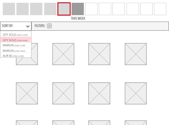
Sort & Filter: Buyers can use the accordion menu on the left side of the screen to drag filters into the “show me” box. The drop-downs below the box allow the buyer to arrange the results in any order they want. The boxes across the top of the UI represent the “Time Travel” feature that was tested in earlier iterations.

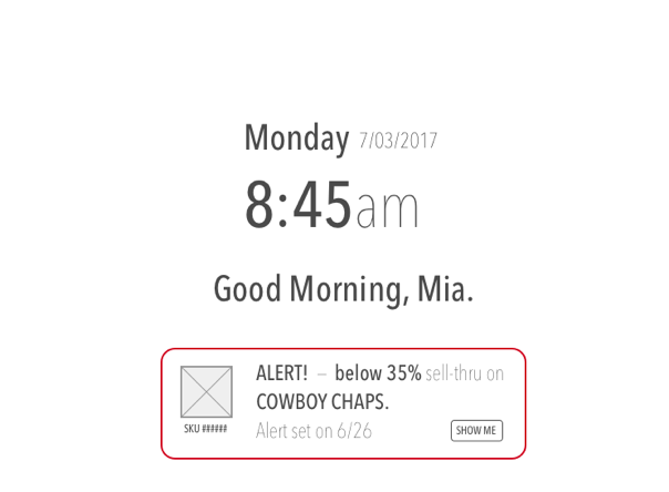
Setting Alerts: creating alerts on specific items is as easy as selecting the card with the product in question, then setting an simple operator (“equal to”, “greater than”, or “less than”), a trigger value, and which parameter to check.  

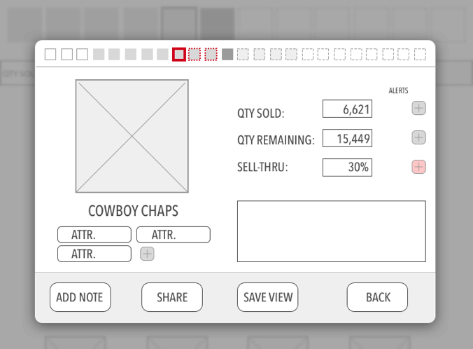
Saving Views: Each time the buyer applies a useful set of filters and sorts on a particular assortment, they can save that view and then browse for it later, when they are performing their hindsighting analysis and planning future assortments. A key feature that we added after receiving feedback from buyers was the ability to add notes (to themselves others with access) briefly explaining the significance of each saved view.

Conversations: In conjunction with LH’s current software features, the messages with a particular vendor always take place in the context of the product in question, and always with images of that item. This saves buyers time by eliminating context switching and reducing the possibility of errors and miscommunications.

Thank You.
Many Thanks to my teammates... 
Gena Hong, Hannah Rosen, JuHo Yoon, and Amanda Holt who helped put together such a successful and creative capstone project.
Back to Top