Challenge and task
As UiPath grew, we made several acquisitions whose GUIs needed to be adapted to blend into our platform, which often included reorganizing the navigation structure and applying our Apollo design system. Moreover, there was some concern that our design system was too inflexible and lacked a 'modern feel' so it was also my one-week task to create a template for the new product and showcase what our existing DS was capable of if applied thoughtfully and accurately.
One such acquisition was Re:infer, which added powerful communications mining capabilities to our overall automation suite. My job was to transform the legacy Re:infer interface by introducing our design language, color palette and font ramp. It also involved an overhaul of the information architecture.

The screen on the left is the legacy UI and the screen on the right my final proposed design after restructuring the IA and applying UiPath's design language.
Step one: information architecture layout
In order to showcase the changes I proposed making to the IA, I created wireframes that made it clear where each section of the app was being moved and that no functionality was being lost.
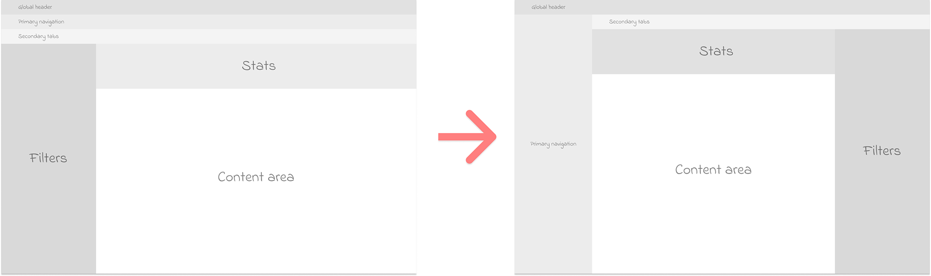
The wireframe on the left illustrates the organization of the legacy app and the right screen represents my proposed alterations to the layout.
Step two: design language, color palette, and type ramp
Once I closed on the high-level layout for the new version, I set about incorporating the UiPath design system, paying close attention to preserving visual hierarchy and accessibility. All of the products I've worked on have needed to pass AA WCAG accessibility guidelines.

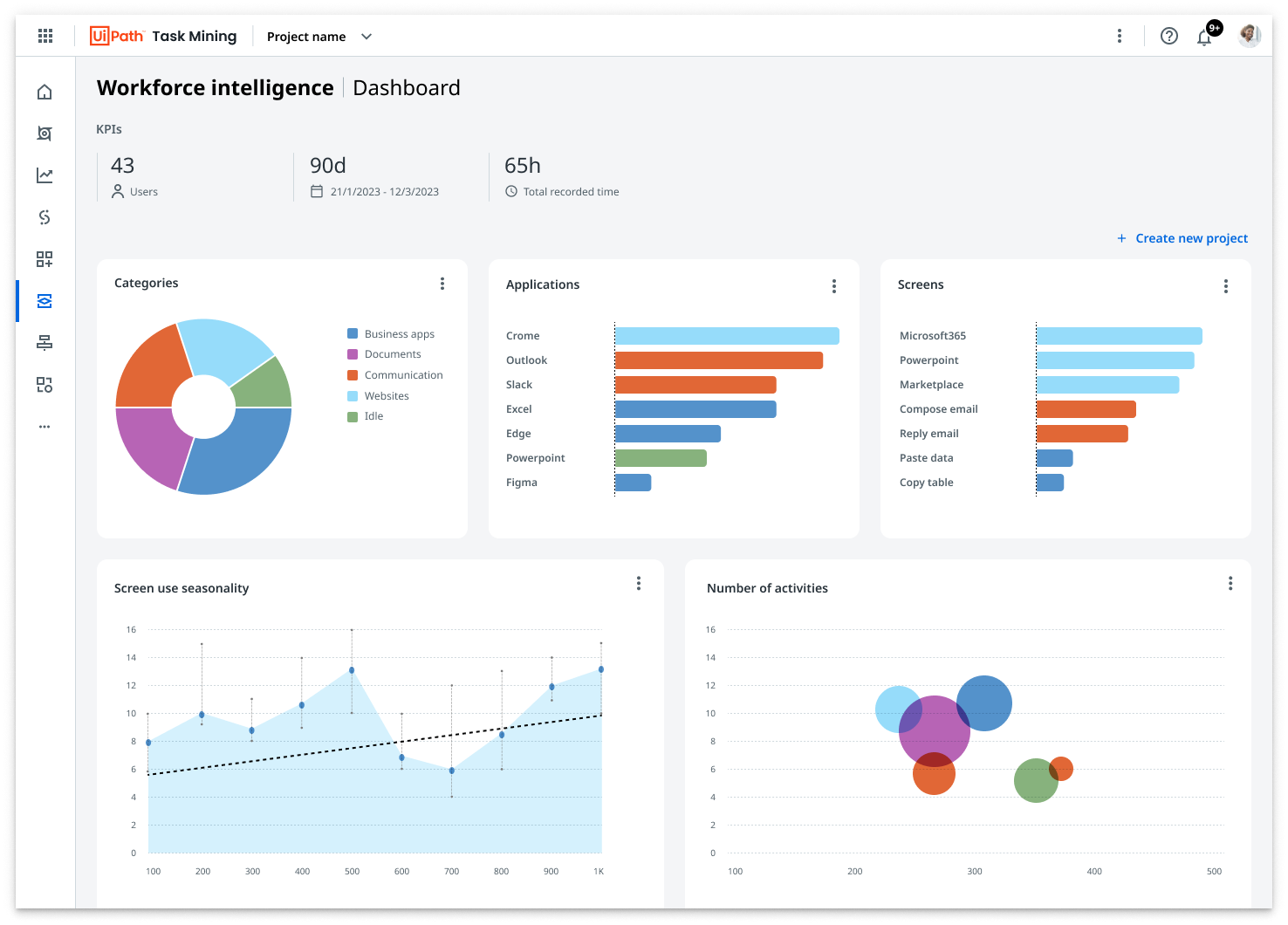
This screen illustrates examples of our branded color palette and standard CTA treatment for text-only buttons and icon buttons. Additionally, it demonstrates how the layout grid adapts to the side nav drawer being hidden.
Step three: annotation and hand-off
Once through several iterations and having received and acted on feedback from several of our principal designers, I captured justifications for all of my design decisions with thorough annotations that any team member could reference going forward.
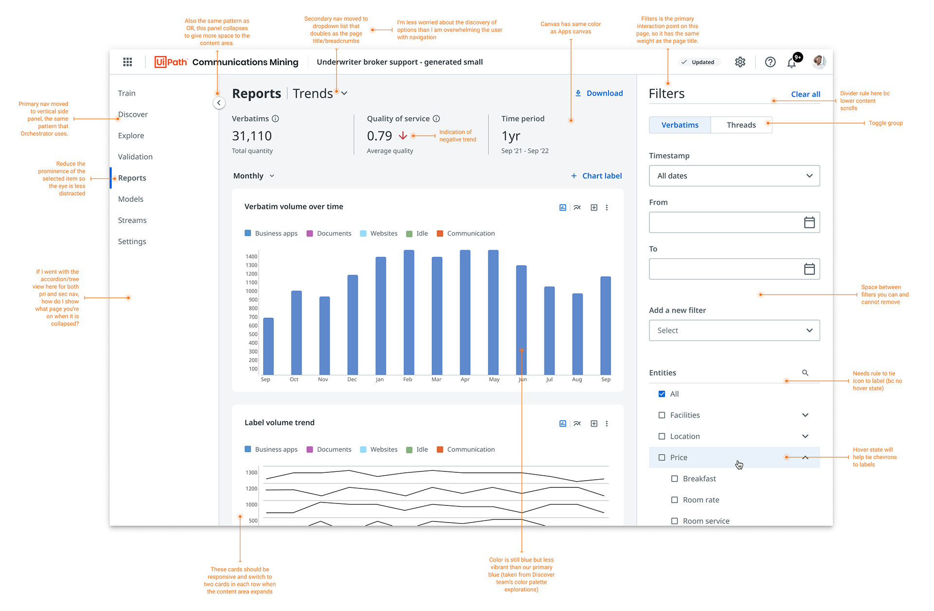
Annotated final recommendation for my redesign of the Communications Mining interface.
Results and success metrics
The result of my one-week effort was a design that visually reflected similar dashboards in our other products and could be used as a 'stencil' for other designers to reference when working on further designs for the product, reducing the time it took for final designs to get approved and handed to engineering.
More importantly, this work illustrated how our Apollo design system could look if applied thoughtfully and correctly, allaying some's fear that it was too inflexible and needed to be rebuilt from scratch. This saved the design team a significant number of hours and resources.