The Challenge
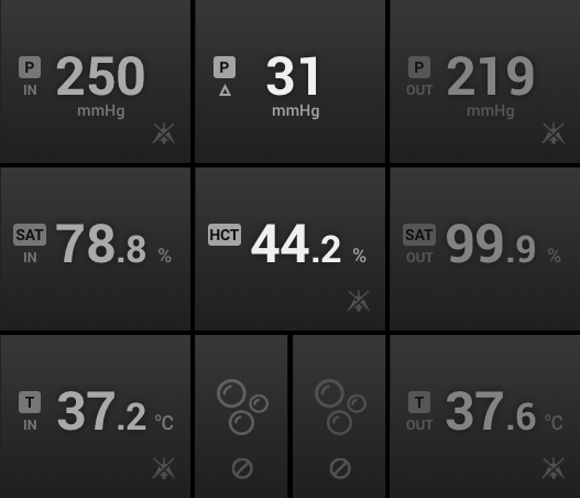
Our client asked us to design the touchscreen interface for their life-saving medical device that is going to be smaller and more portable than competitive units. Normally reserved to dedicated rooms within a hospital, this artificial heart & lungs is small enough to be used inside ambulances and transported, along with the patient, via gurney to the Emergency Departments of hospitals.
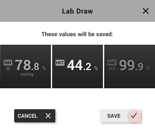
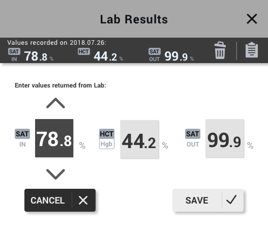
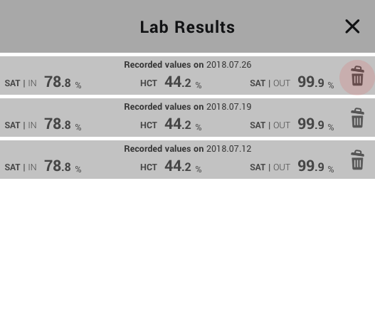
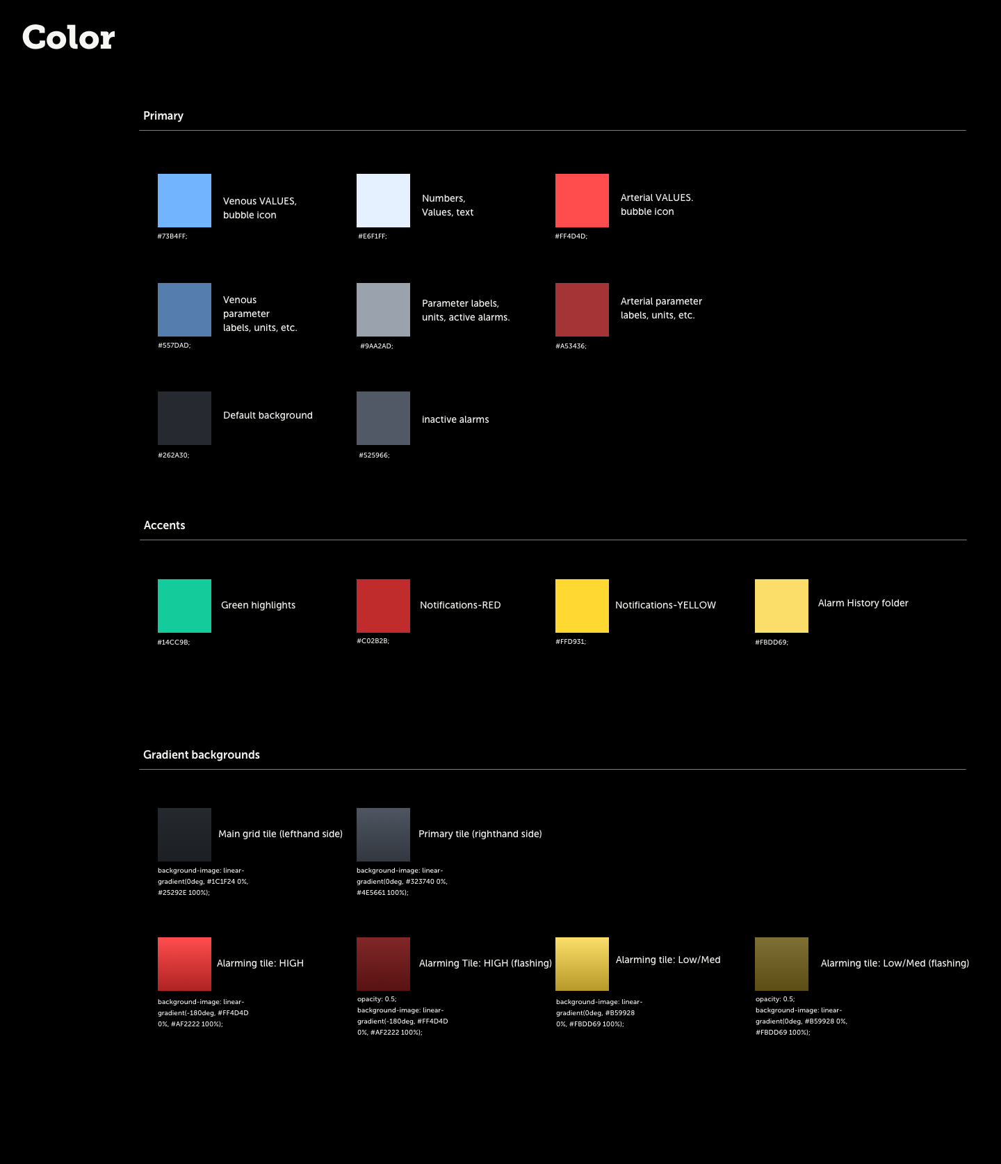
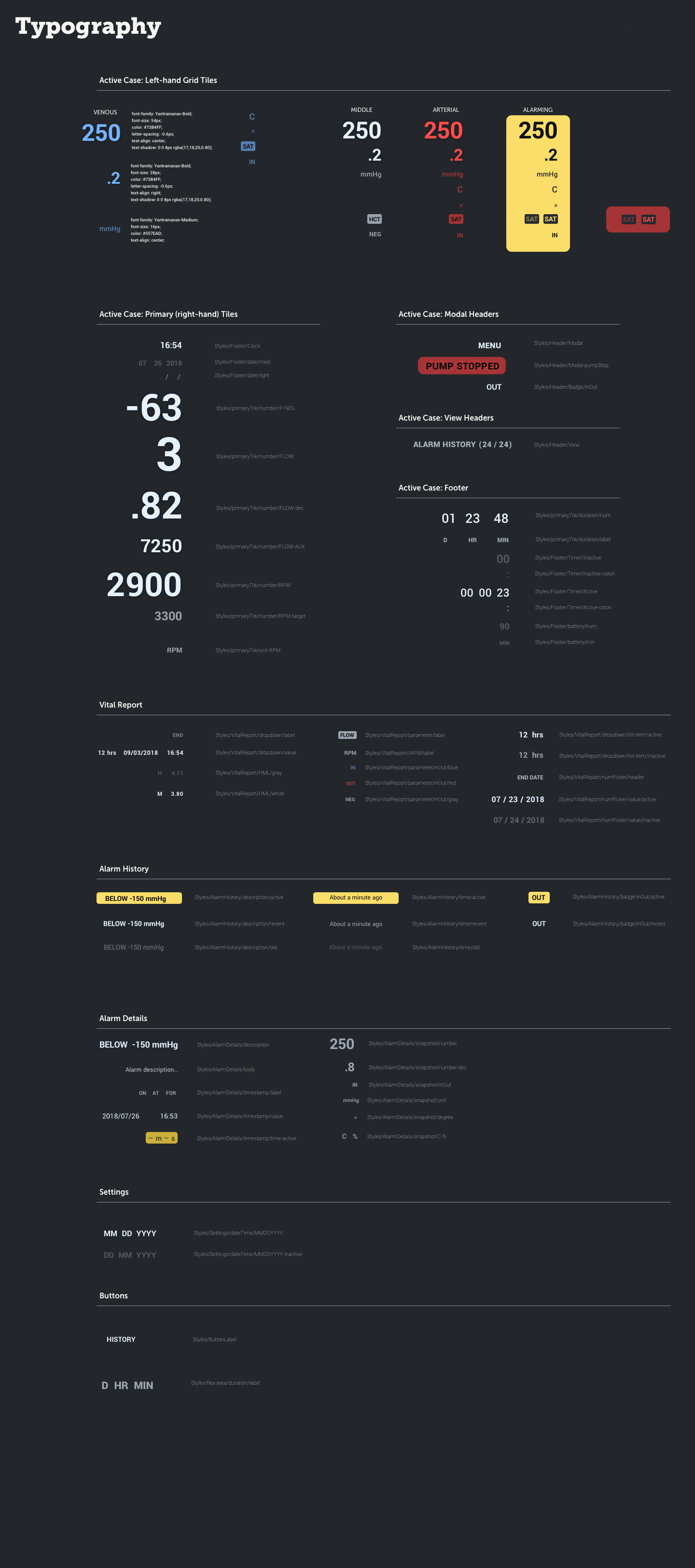
My team of interaction designers collaborated with our consultancy's industrial design team on this project, and final deliverables to our client included an interactive web-based prototype that could be run on a tablet simulating the screen of the device, a complete set of high fidelity screens with all assets ready for development, and a style guide that defined typefaces, color palette, and component dimensions.
Gathering Requirements
1) The first step in the process was to download, from our client, as many details about the various use cases for this device, as well as generate a list of requirements, from both the FDA's regulations for medical devices and limitations with the already chosen hardware and software's capabilities.
Part of my job was to research standard UI practices within the medical space, especially those that would be found and operated alongside our ECMO unit in the emergency room. After a just a small amount of research, I confirmed that the most common piece of equipment in hospital rooms is the EKG monitor. Therefore, it was a great device to take inspiration from when defining interaction paradigms. This would ensure smooth integration and interoperability - in other words, a guarantee that our device would play well with others.
I was responsible for presenting these research findings and design recommendations to the rest of the IxD team.
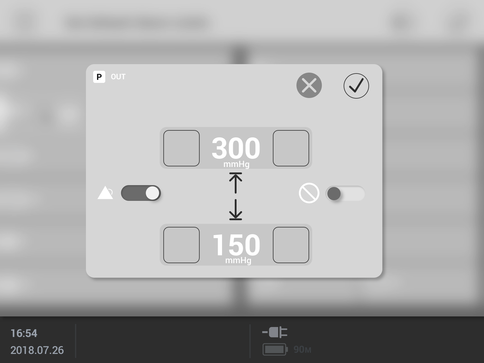
Next, my colleagues in the IxD department and I worked with our client to generate a comprehensive map of the functionality of this device. That map was instrumental in determining the overall structure of the digital interface: the placement of components on the screen, which functions should be accessible from the home screen versus tucked into the menu, and when to use full screen "tabs" versus popover modals to perform certain tasks.
Wireframing
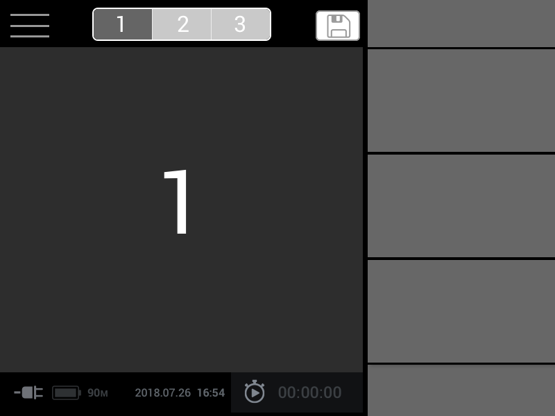
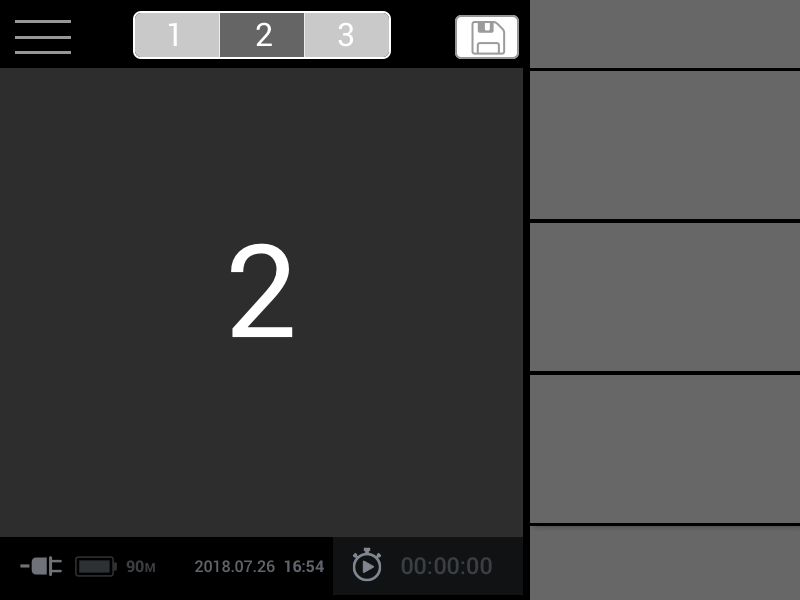
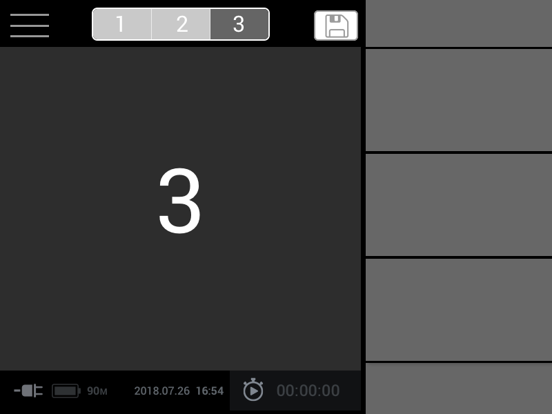
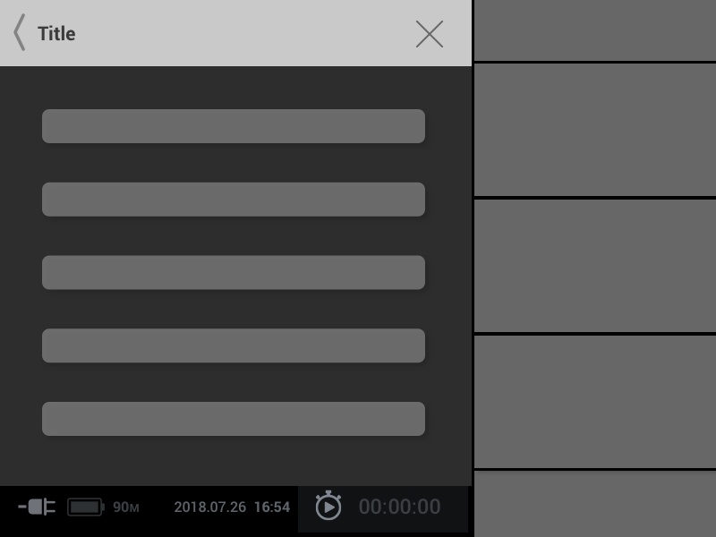
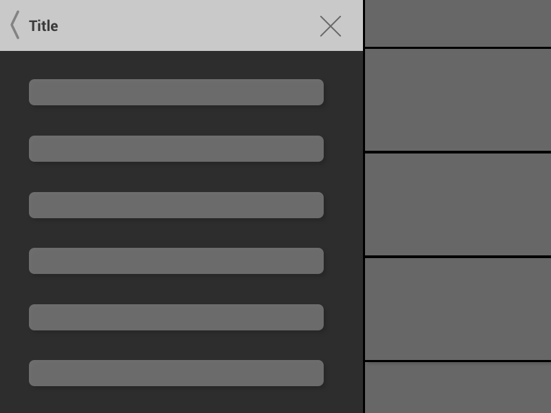
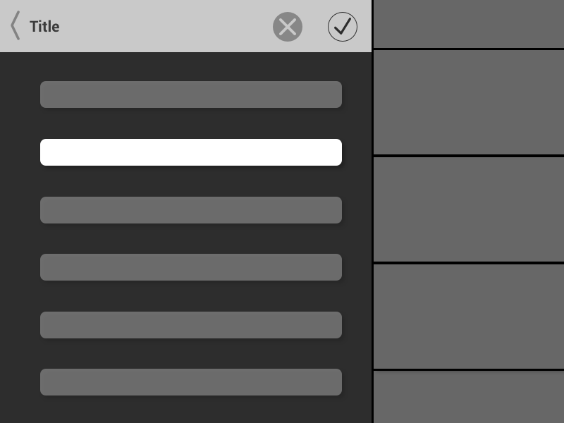
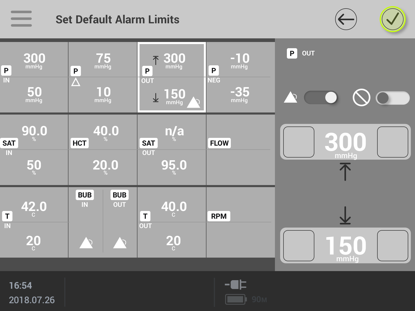
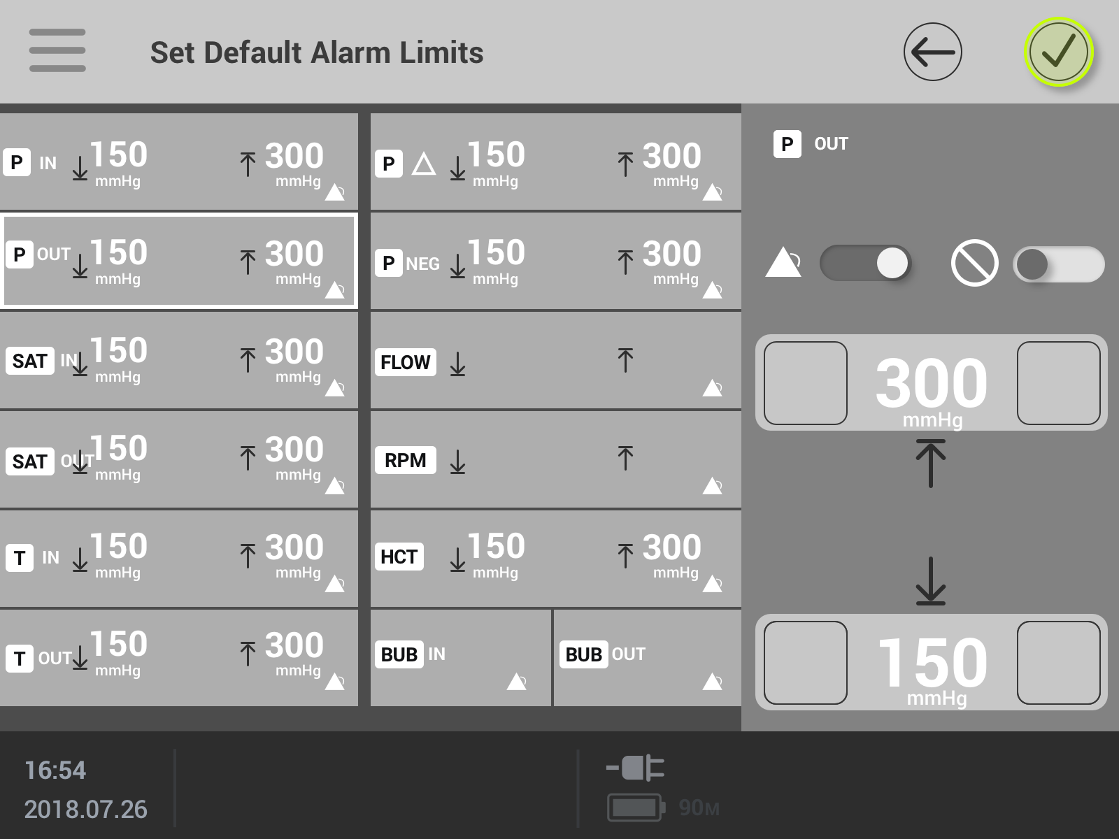
I was responsible for turning that concept map into a set of wireframes that later formed the scaffolding for the final UI designs. My wireframes underwent several iterations and served to establish the interaction language that would best serve the intended purpose of the interface: intuitive navigation and quick access to the most important information at all times.
Clear Communication
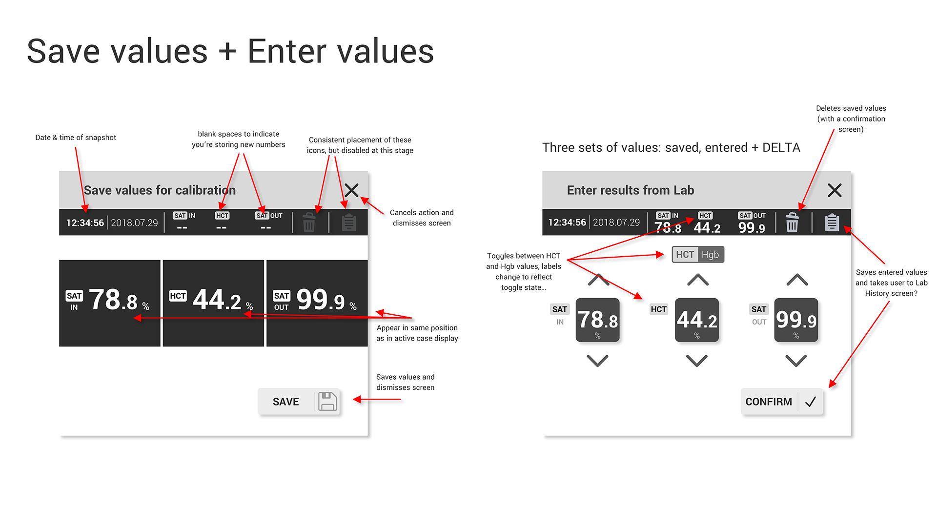
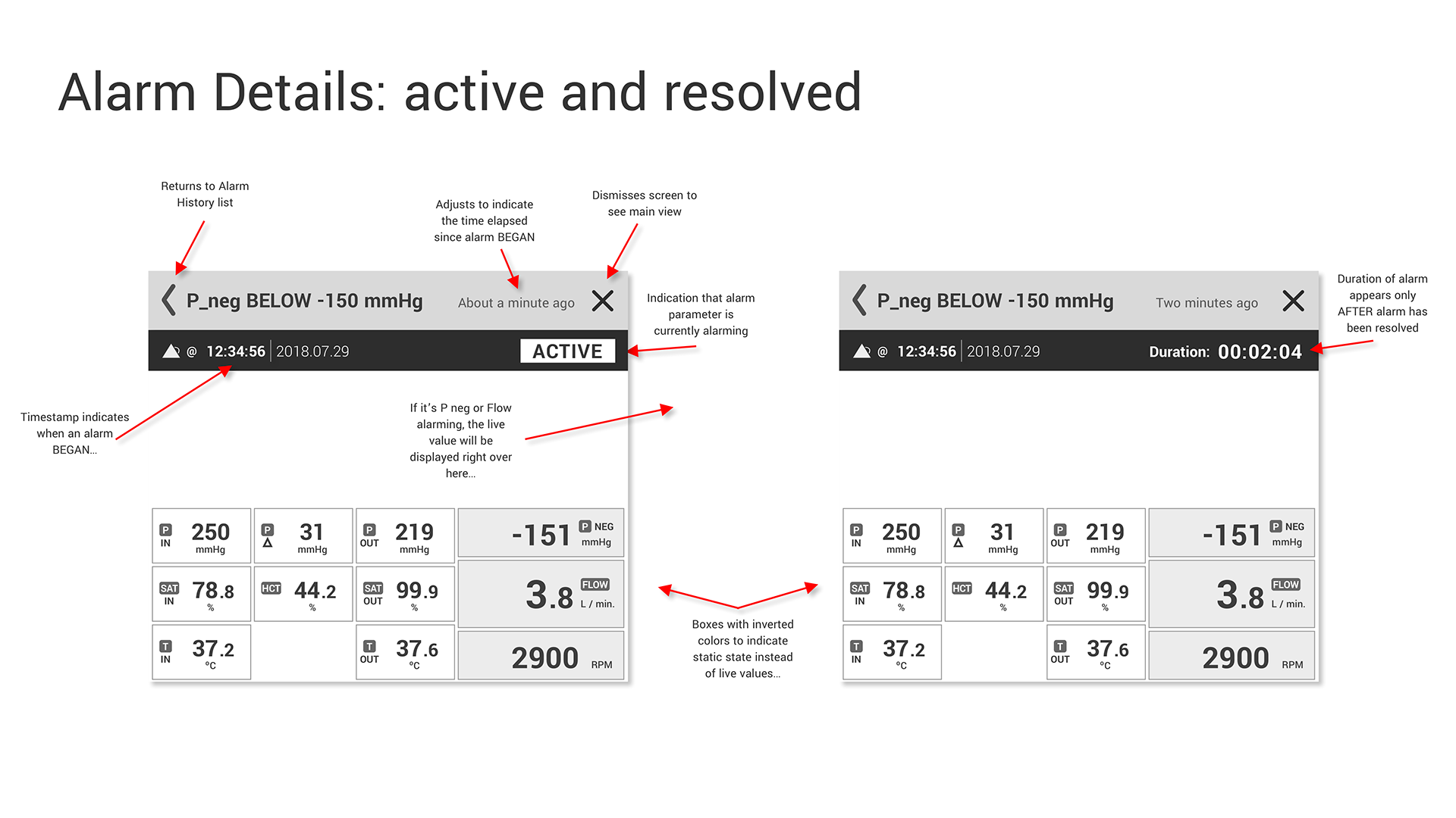
I was also responsible for illustrating how the UI would change over time. I demonstrated this in three ways for our client: the first was by generating animated GIFs using a Sketch + Principle workflow, the second was by inserting storyboards into our client-facing presentation decks, and the third was through sets of annotated wireframes and interface components that could be shared and digested asynchronously between our shared meetings.
Communicating interaction design via:
1) Animations
2) Storyboards
3) Annotated wireframe components
Interactive Prototype
Once our team began skinning the UI with production-quality assets, I was in charge of keeping our Sketch design library for the project organized. I also used Invision to build interactive prototypes that we presented to our clients each time we met with them. Taking advantage of the "tour points" and comments in Invision we were able to walk our clients through our design decisions and capture feedback from all the stakeholders involved in the project.
More examples of the final UI can be provided upon request, pending approval from our client, who is still testing with our prototype and will subsequently build their new product's UI with a 3rd party software development firm.
The Deliverables
To ensure compatibility, we were always presenting our ideas to the development team that was asked to implement the final user interface for this product. When it came time to hand assets off to them for development, I created a comprehensive style guide set up as a reference for both developers and other designers. Playing a supportive role to the visual designers, I used a system of layer styles and text styles to ensure this style guide automatically updated any time elements of the UI were changed, which drastically reduced the amount of time needed to prepare the assets to hand off to our client.
In addition to this style guide, all assets were prepared for development using Sketch + Zeplin, which provides all necessary specifications for software development teams to implement features and assets created during the iterative design process.
Summary
This project allowed me ample room to flex my research chops, practice my client interaction acumen, and improve my design system management skills. As one of three interaction designers working on this ECMO device's interface, I had a significant impact on both the interaction design and the visual design of the final deliverables. I gained valuable experience working closely with industrial design teams, software development agencies, and stakeholders, each bringing their own agenda and conception of the final product to the table.